Massachusetts Data Hub
Improving how constituents find open data
Roles
UX Strategy, Research & Analysis, Usability Testing, UI & Interaction Design
Overview
I provided UX consulting to Massachusetts Digital Service under the Executive Office of Technology Services & Security (EOTSS) prior to the public launch of a new tool to connect constituents with open data: The Massachusetts Data Hub. Their development team built a prototype inside mass.gov, using existing Drupal modules and a custom homepage. Working directly with the Data team (including the Chief Data Officer, a team of Content Specialists, and a Product Manager), I helped prioritize and implement design improvements for the first release.
Project Goals
In this initial design phase, the Data team had two main goals:
1. Improve the findability of data.
2. Make the user journey more uniform.
Why focus on findability?
In the prototype, search accuracy was limited. The search field pulled from the content of each data listing page, and the metadata in each page varied depending upon what the content author added. (For instance, a data listing with education statistics might not have metadata like “school” or “student” that a visitor would expect in a keyword search.)
And, why uniformity?
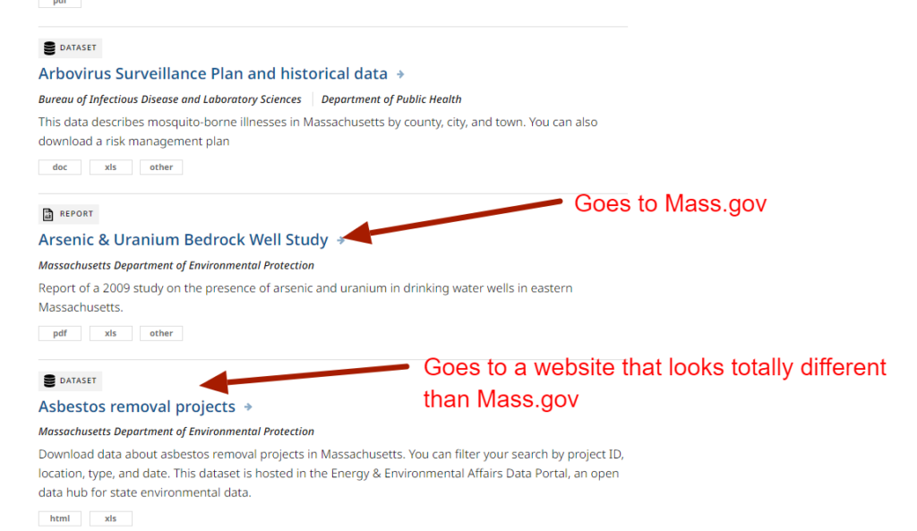
When searching for data, the journey was not always visually consistent. Data listings could be one of two content types which each had different layouts (a “data catalog” or a “data set”), or they could be external pages or files on other agency sites (e.g. mass.edu) with different visual styles than mass.gov / the Data Hub.
There were intentions to standardize the data and platformize the hub (e.g. using Socrata or a similar platform) in the future, but this phase would focus on the improvements that could be made using the current structure of mass.gov, including the existing paths and modules.
Challenges & Technical Constraints
– Design improvements would be limited to the existing site structure, paths, and modules.
– In terms of improving findability, no improvements could be made to the search field logic in this first design phase. No existing data or content inside the hub could be reformatted within the scope of this phase. (For example, a graph in an external pdf file)
– A lot of data in the hub lived outside of mass.gov, on other agency sites
– Time was limited; ~300 hours of work had been approved for this design phase.
Discovery
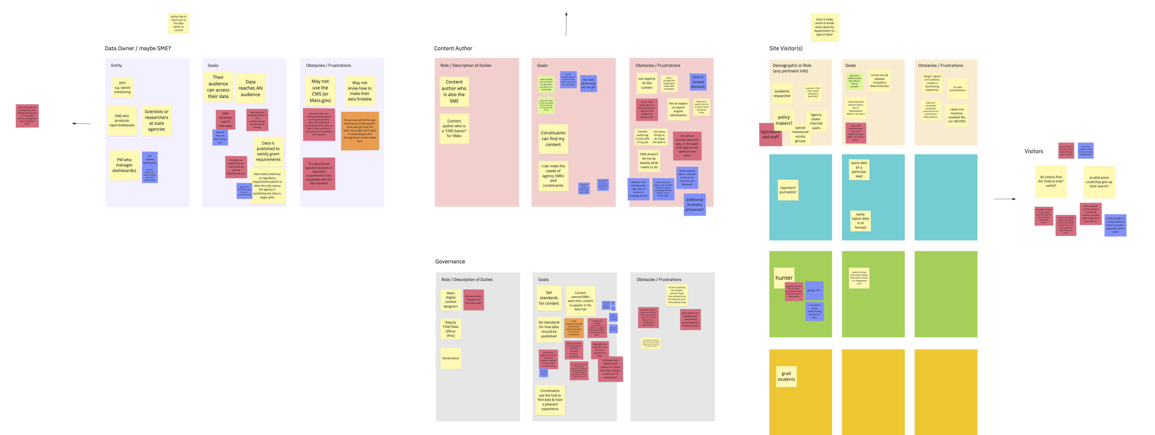
I facilitated an interactive workshop with the Data team to help define each user group attached to the Data Hub and get a better understanding of their goals and frustrations. This revealed there were a few types of users connected to the Data Hub, both on the contribution side (who add data) and the public-facing side (who look for data). The exercise also surfaced some concerns regarding the amount of control the Data team felt they had over the data, as there were many contributors and no formal standards yet in place.
The workshop helped us answer, “What is in our control, and what are realistic goals, expectations and outcomes for this design phase?” We needed to start somewhere, and while the data standardization process across all government agencies would develop over time, we all came out of the workshop confident that even smaller-scale changes would be valuable to improve the experience of the Data Hub.
Research & Analysis
Component Audit
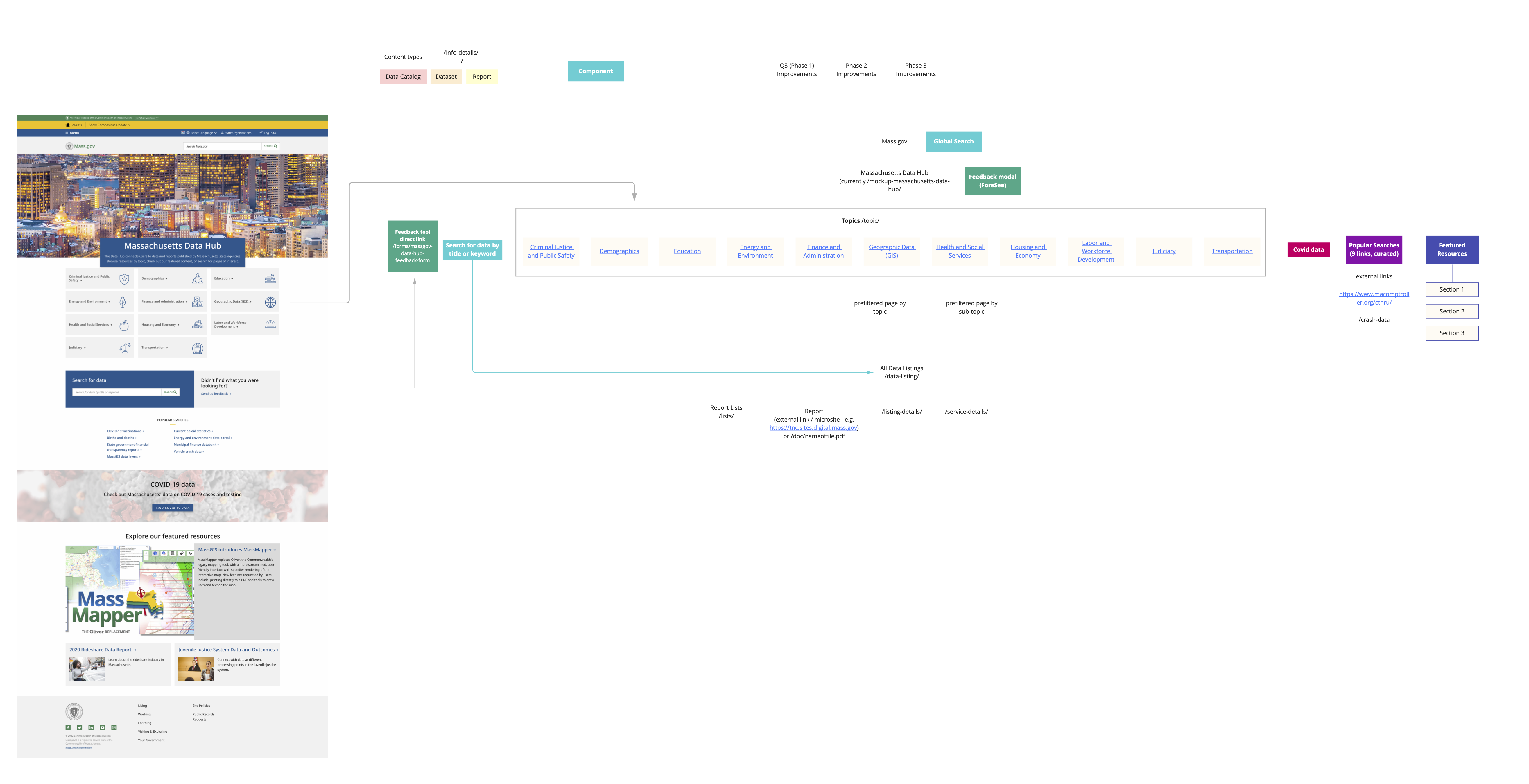
To get a better idea of the site structure and the exact technical constraints, I did a component audit of mass.gov and made a simple map showing how everything in the Data Hub was connected.
Peer Analysis
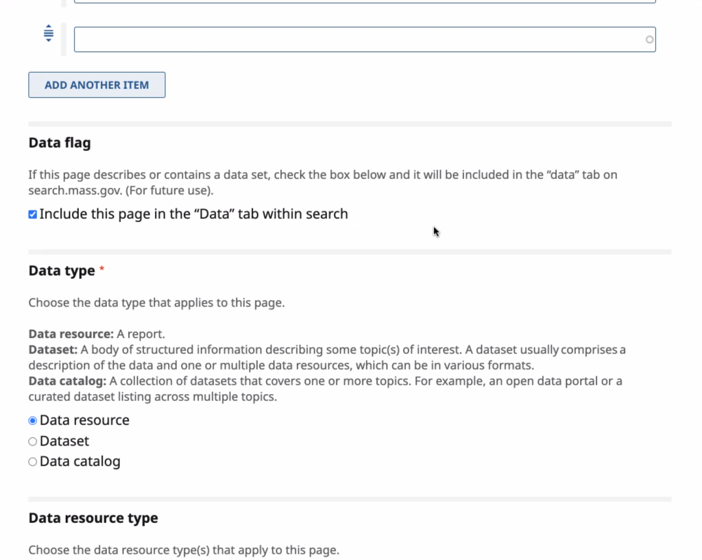
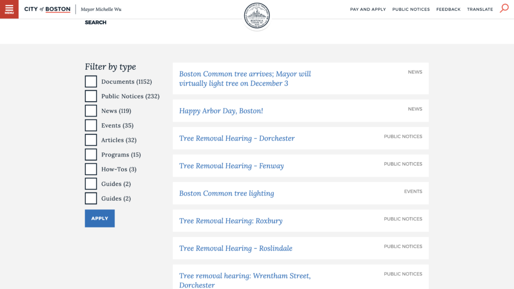
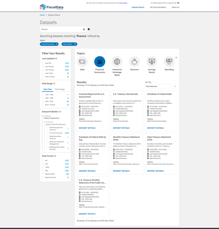
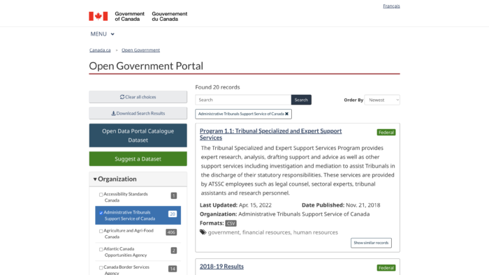
I did a quick peer analysis of other government products to get a better understanding of common design patterns, and to see some examples of well-designed UI elements that influence findability (e.g. filtering options).
Expert Review (UX Audit)
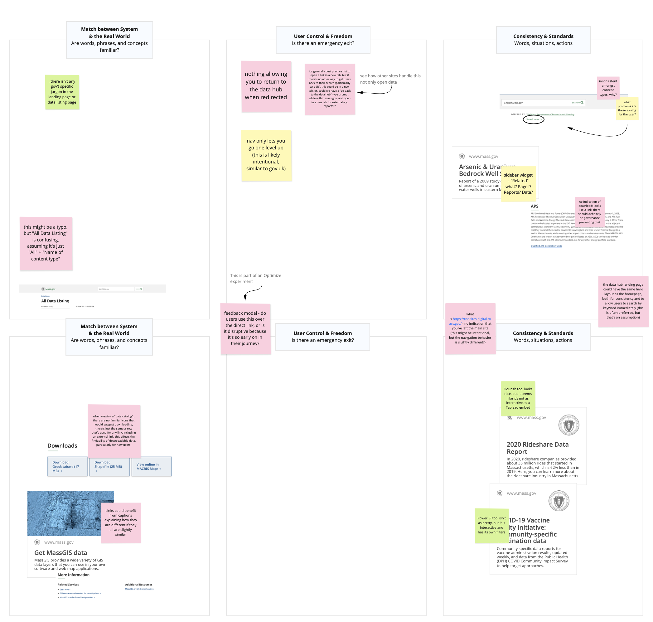
Referencing standard usability heuristics and UX best practices, I completed an expert review of the MVP to identify glaring issues.
Based on search analytics that were available, two of the most common use cases were a constituent looking for an annual report and a constituent looking for a visualization to help them interpret data, so I focused on these during the audit.
Some of the more critical issues I discovered were:
– In the data listing search results, there was nothing to indicate when clicking a listing would eventually lead the user to an external URL.
– Clicking a data listing would open an external URL (a file containing data or a link to another agency site) in the same browser tab. This is often considered best practice, however in this particular journey the user would be removed from the Data Hub with no warning or way back to their search results. (There are strong opinions about opening links in the same browser tab, but at the very least I felt we needed to observe how users reacted to this and learn more about their expectations.)
– Many important elements, including the homepage search field and the link to “Apply Filters” when filtering search results were “below the fold” on most common screen sizes.
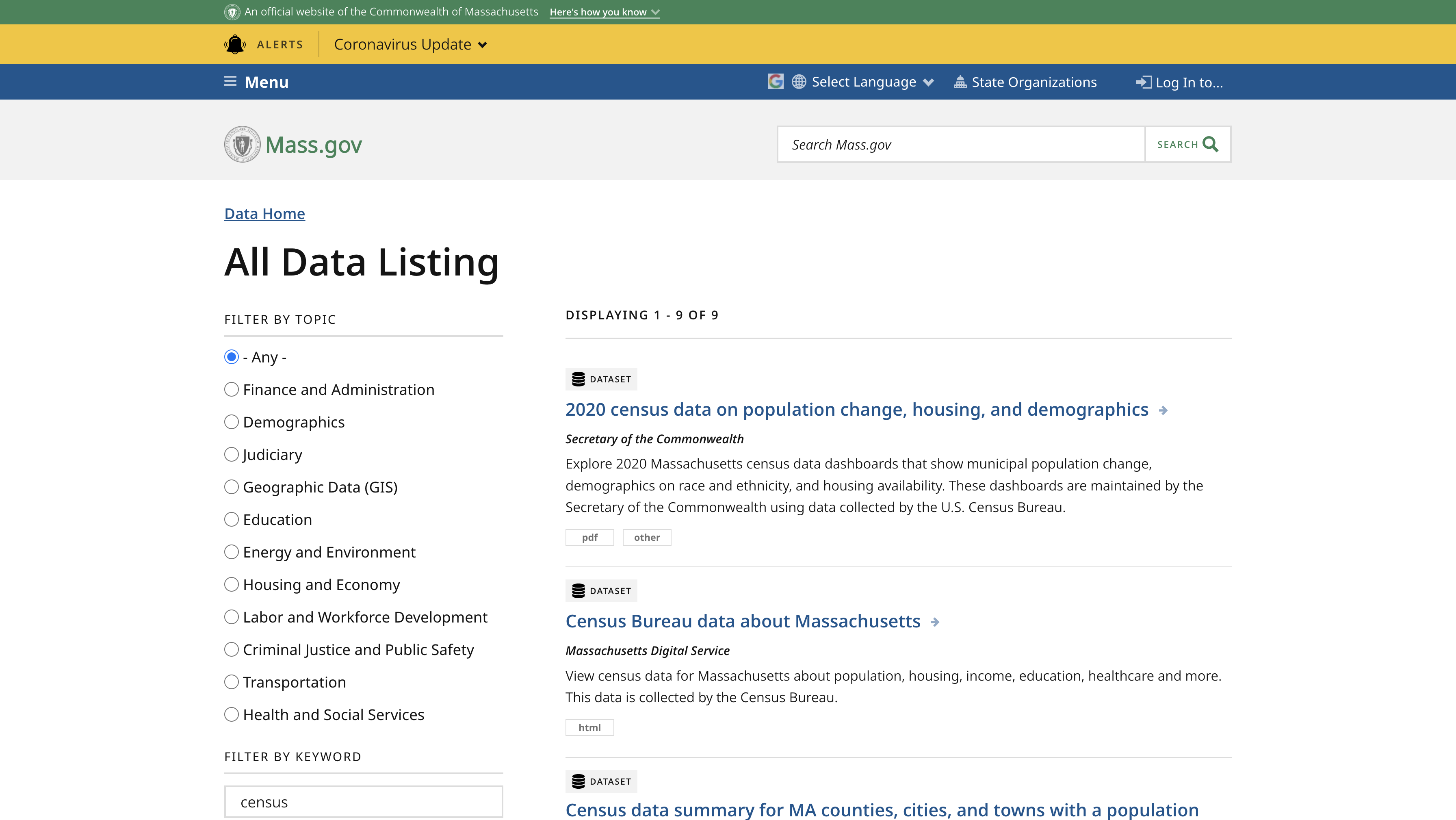
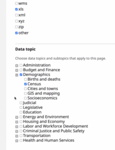
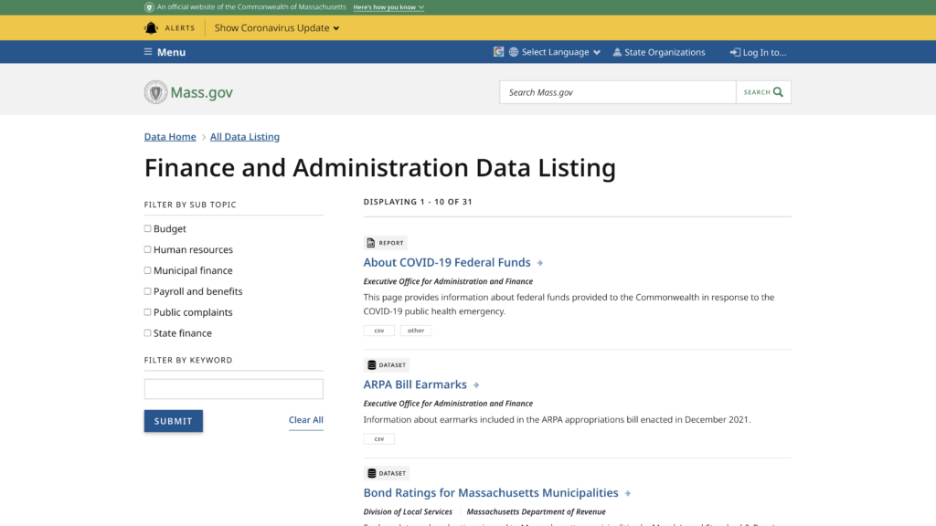
– If a user filtered their search by topic (pictured), they could only see the sub-topic options under that one topic.. In order to see other data topics or sub-topics, they would have to go back to the homepage and choose another topic.
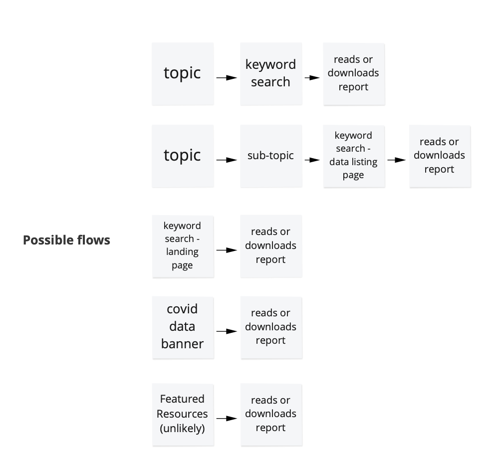
Usability Testing
I led 10 moderated usability tests via Zoom. The only criteria for participants was to not have any familiarity with this Data Hub project. The testing plan would focus on the same two most common use cases that had been focused on during the UX audit.
Our team had the following objectives going into this round of usability testing:
1. Validate any assumptions from our discovery exercises regarding user frustrations or obstacles during the data search journey.
2. Reevaluate any recommended improvements proposed during the UX audit.
3. Identify any usability issues within the full data search journey that we may not have anticipated.
4. Begin to prioritize these issues and any potential improvements connected to them.
Each participant was first asked to find any piece of data in any way they preferred (an open task), then to find Covid-19 Vaccination Data (which at that time was the most popular data search) in two different formats. Before completing the tasks, they were asked a few questions regarding their familiarity with the existing version of the Data Hub and/or with open data.

Key Findings
– Overall, the Data Hub was off to a great start! All participants successfully completed each task, and all but one described their search for data as “easy”.
– Every participant was able to move forwards or backwards through the journey from beginning to end. This didn’t mean there weren’t opportunities to improve navigation, but that showed we could prioritize other issues.
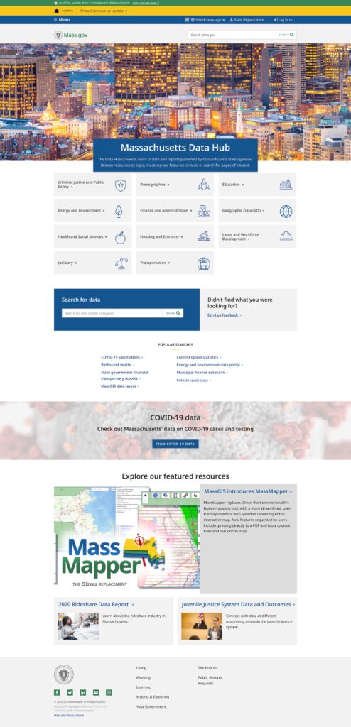
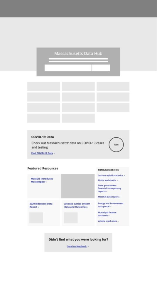
– Most participants immediately referred to the topic tiles in the homepage as a way to determine everything that was in the hub. They did not scroll down to see any other information, including the featured datasets section.
– Most participants noticed the global mass.gov search field on the top of the site before the data hub search field, which was “below the fold”. – Also, only one participant started any of their searches from the data hub search field because it was so far down on the page.
– Based on familiar design patterns, many participants expected filters to automatically be applied (without clicking “apply filters”).
– Most participants chose to filter by sub-topic and gave feedback that the sub-topic filters were valuable.
Pre-launch Improvements
Based on the testing feedback and UX audit, the Data team chose to prioritize changes to the homepage layout, improvements to the search filters, as well as to add a redirect notice if a user was leaving the Data Hub.
Launch
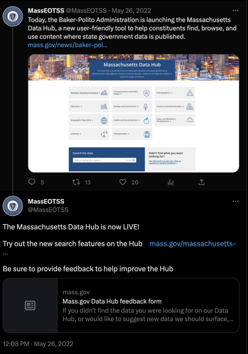
The Data Hub launch was well-received, and the Data team was commended by the Technology Services & Security Cabinet Secretary and Chief Information Officer for Massachusetts. They immediately received helpful feedback from the public via a feedback form, which would inform future design iterations.
Post-launch UI Iterations & Concepts
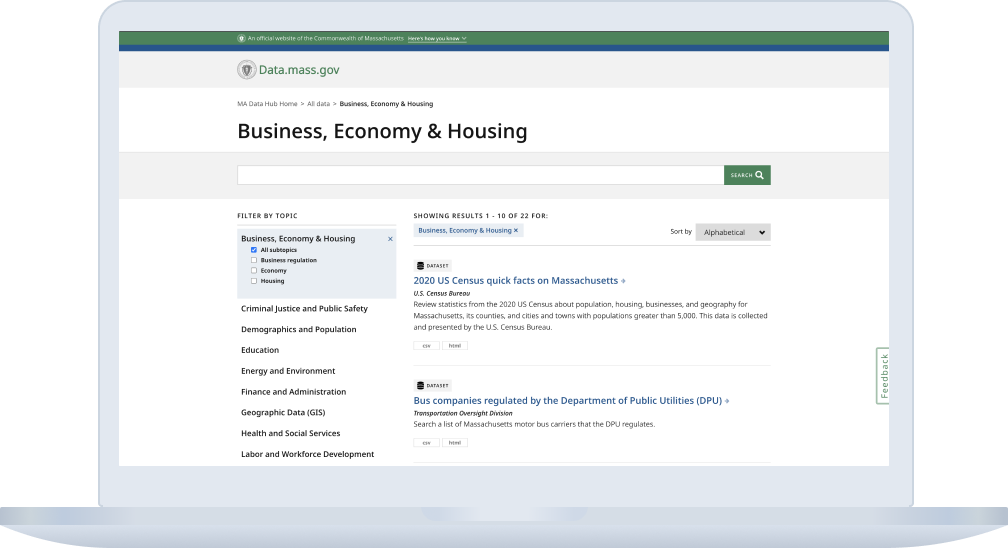
Working off of the Commonwealth’s Mayflower design system, I collaborated with Massachusetts Digital Service’s UX designer and Technical Project Manager on concepts to improve filtering options and to improve the flow from each entry point to viewing the data.
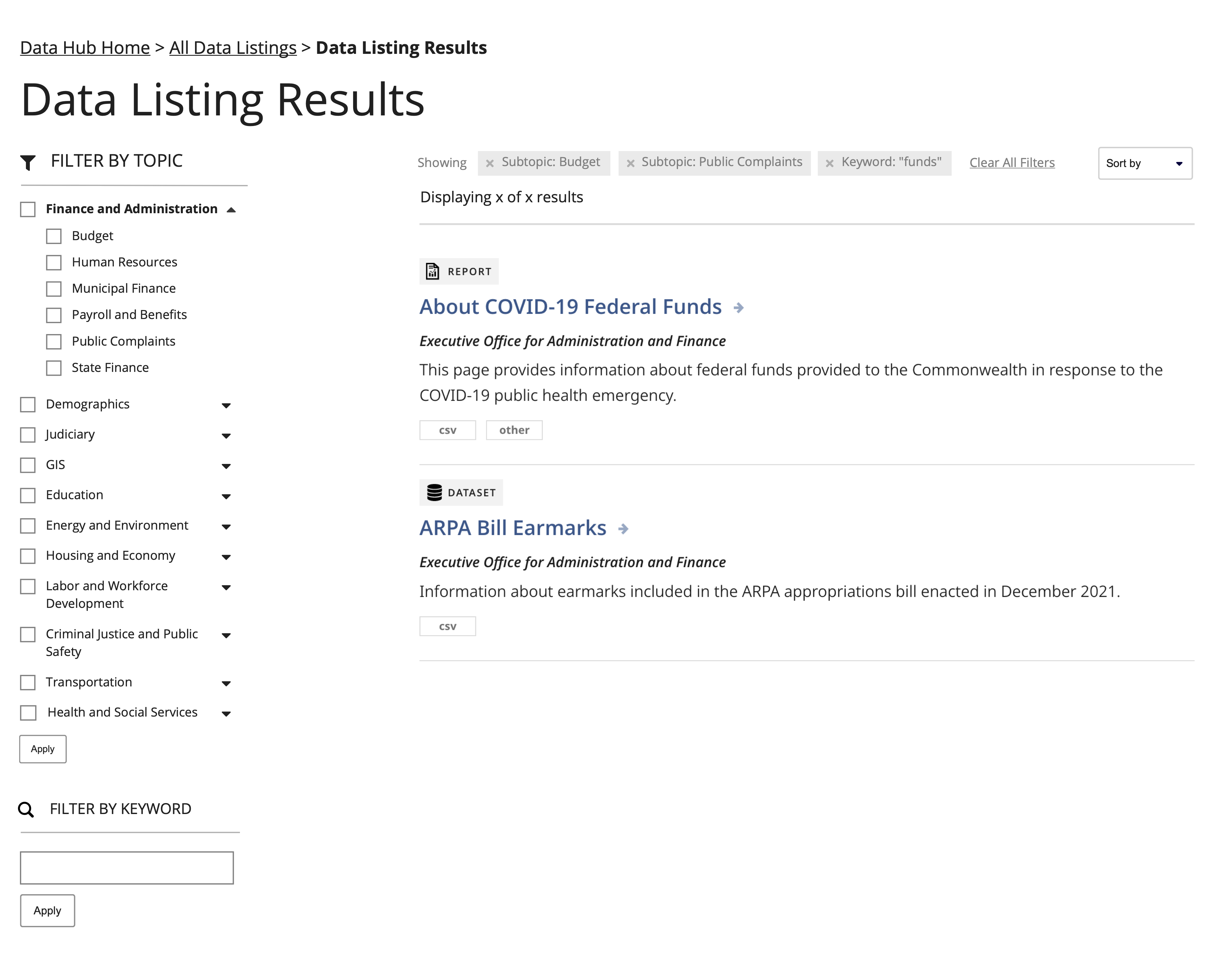
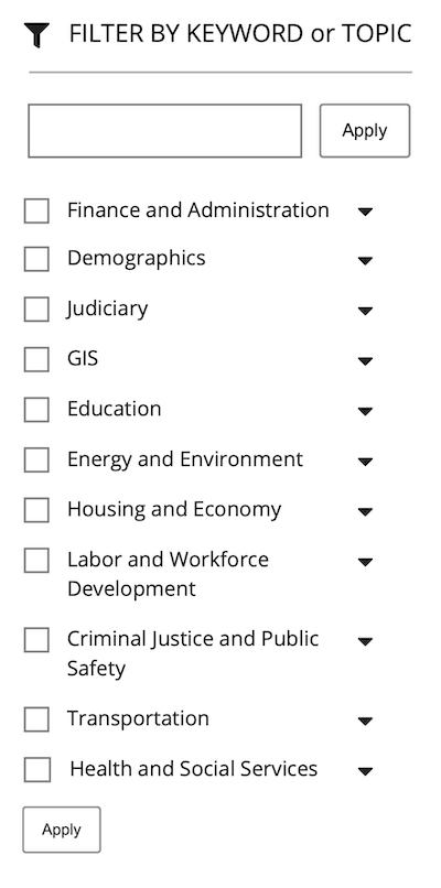
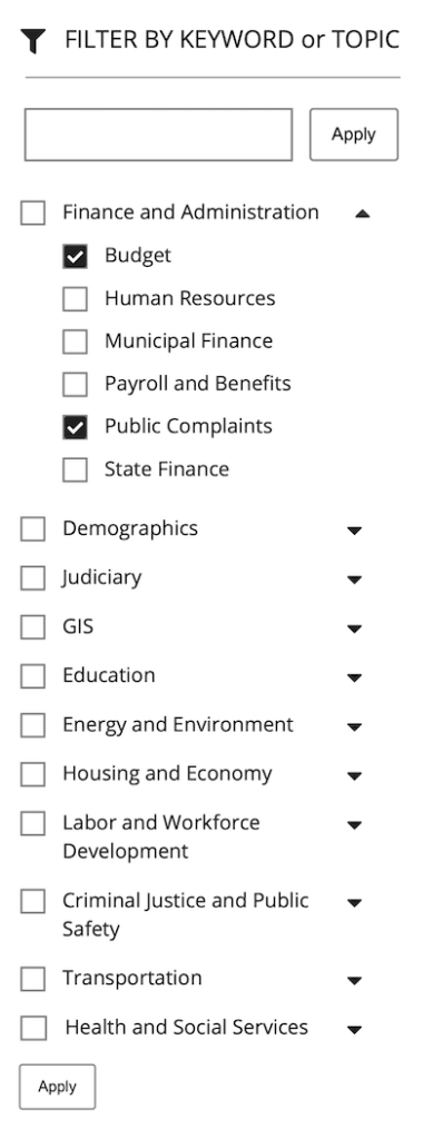
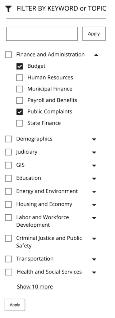
Additionally, I put together a couple of concepts for indicating external URLs in the data listing search results.
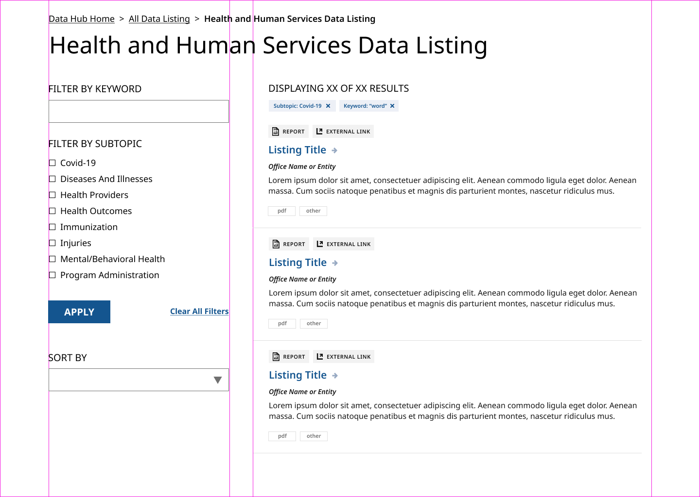
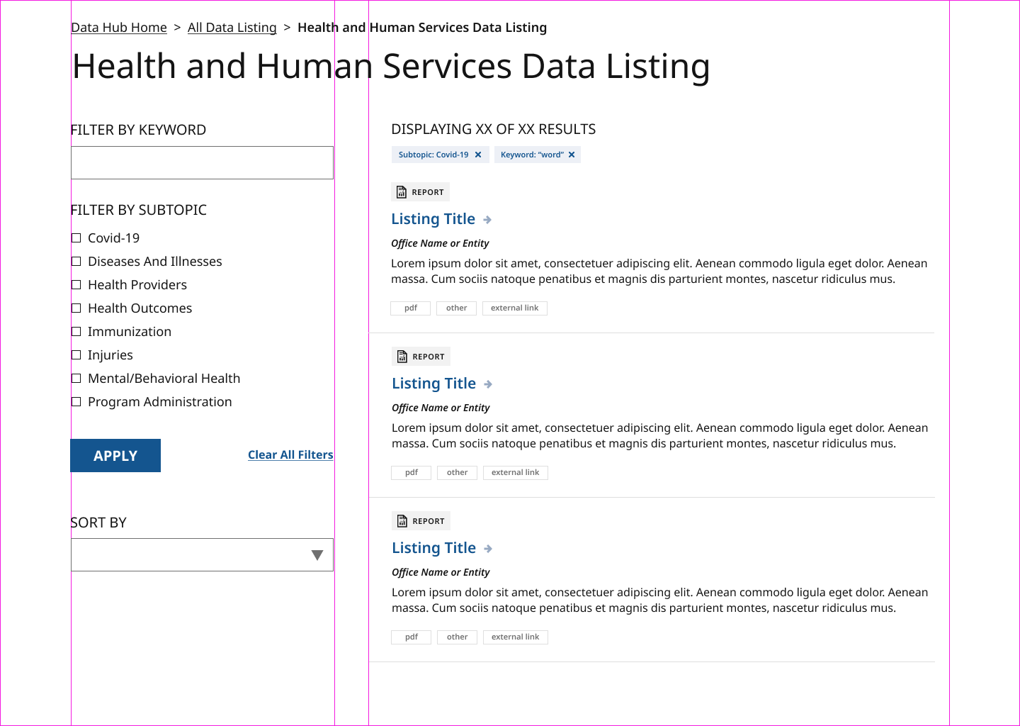
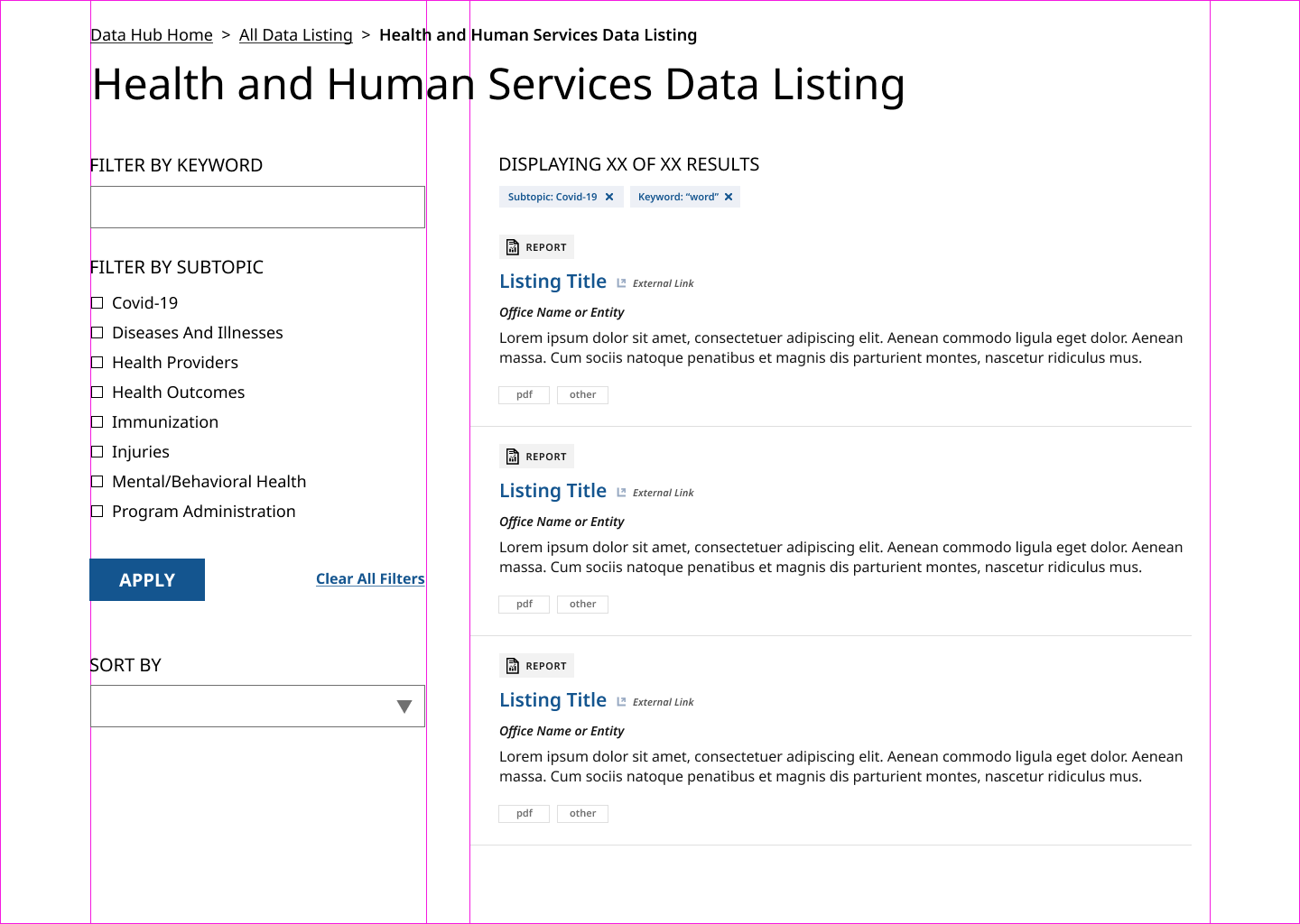
Many of these designs have been implemented in the current version of the Data Hub.
Reflections
As someone who’s interested in civic data, I was very excited to be involved in this project from the beginning. The Data Hub has been an important project for Massachusetts Digital Service’s Data team, and it was great to be able to collaborate with them as we all learned more about how to best meet the needs of contributors and site visitors.
The biggest challenge of this project may been simply finding a place to start and creating guardrails that made sense during the timeline when their vision was (understandably) so big…and, potentially, a very long-term engagement. I always look forward to seeing new iterations as they are released.
©2024 Julie Isabel Cohen
